
Data You Can Feel
How a studio seeks to drive action by making digital data tangible.
In our digital age, we have a wealth of open data at our fingertips. Climate charts, inflation graphs, temperature maps — the list goes on. The proliferation of these data can lead to a cacophony of information that plays into digital fatigue (there is a graph for that, too) and often the overflow of information can lead to less rather than better understanding of different phenomena. You need to know where to start, how to sort the huge amount of information available and finally, how to visualize it.
Some remedies to this have come in the form of data visualization, content curation, among others, but what if we were to go a step further, by removing the data from the digital sphere altogether?
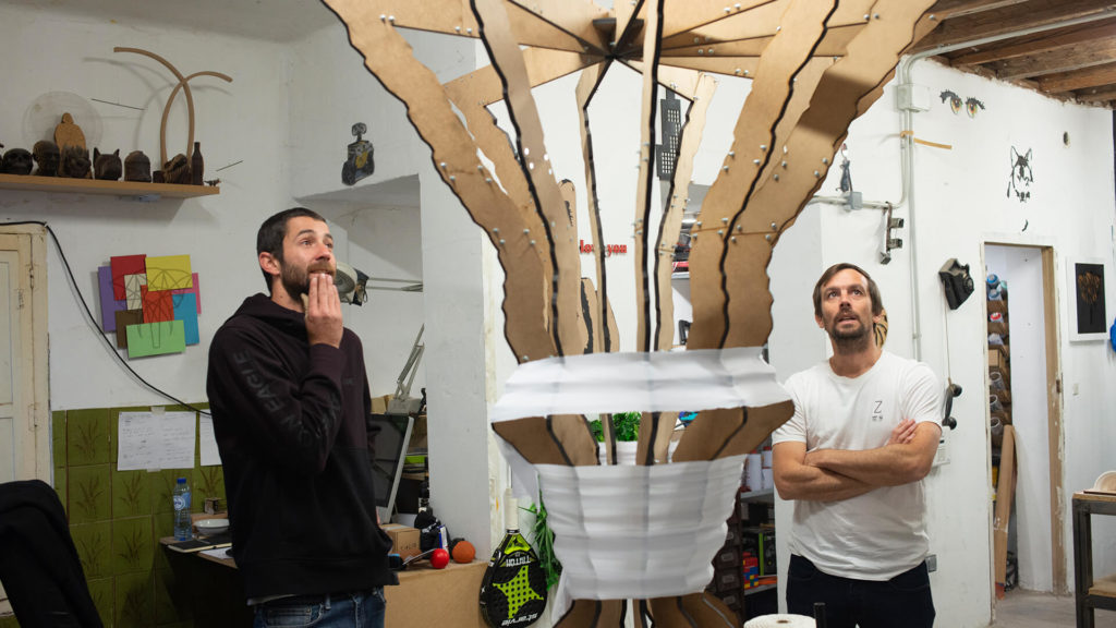
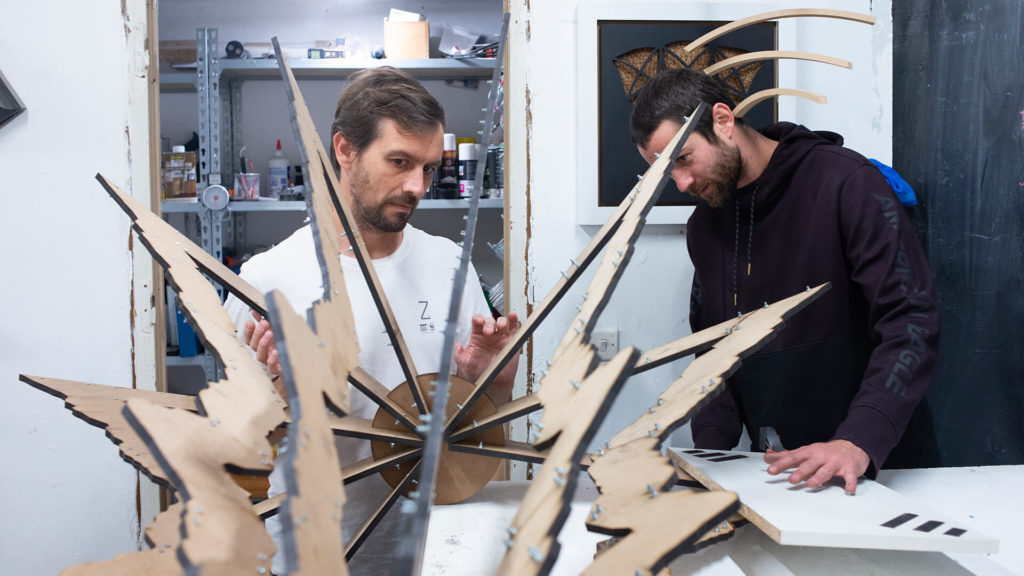
At the Tangible Data workshop on the outskirts of Madrid, two creators stand back to observe a prototype of their latest design. Rising like a volcanic plume from the table in front of them are 10 evenly spread, jagged bolts of laser cut wood that have been fixed together by nuts and bolts, and partially wrapped in a white cloth as a part of an ongoing experiment to see what materials can be used to embellish the details.
The bottom half of the structure is marked by a series of undulating waves that rise to the final third of the model, at which point it blooms out rapidly to an area far greater than the base. Each of the wooden components is identical down to the smallest groove. Taken individually, the shape of the planks might even look vaguely familiar.
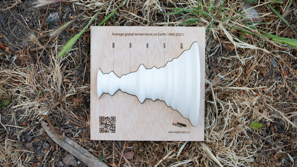
There’s a good reason for that. What we are looking at here is a reimagining of a NASA line graph tracking the smoothed global average temperature between 1880-2021. This becomes clearer for the viewer with a tilt of the head.
Bringing data to life
The graph is alarming enough by itself, but by removing it from the digital world and reimagining it in the physical one, Antonio Moneo, founder of Tangible Data, and his colleague David San Román Gomendio, a creative whose dedication is evidenced by the numerous artworks on display in his workshop, have literally and figuratively given it a new dimension — one that makes you stop and think.
When you put it in a non-digital context, and you place it in front of something that is related to the data, you can use the context to understand the data and the data to understand the context.
The pair are set to display the final product at the 2023 Data for Development Festival taking place between 7-9 November 2023 in Uruguay. It is their largest work to date, which is fitting considering the scale of the challenge it represents.
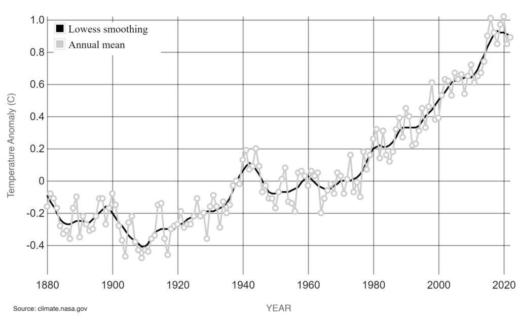
The sculpture recasts the NASA data, which shows how the average global temperature has increased just over 1ºC (33ºF) since 1880. Armed with the context, the viewer can read further into the design and pinpoint the last time temperatures dipped below average in the mid-1970s. The rapid opening of the structure at its top end is explained by the record-breaking temperatures we have witnessed in recent decades, with 2016 and 2020 claiming the grisly accolade as the hottest years ever (so far).
“When you put it in a non-digital context, and you place it in front of something that is related to the data, you can use the context to understand the data and the data to understand the context,” Moneo told REVOLVE in his workshop.
San Román and Moneo took the raw data and introduced a 10-year moving average to soften the edges of the sculpture. For Moneo, a self-confessed open data and sustainability lover, this process of data physicalization not only makes data more accessible, but it can also awaken a curiosity in the viewer and drive action by making people think.
Moneo added that they want to create “data sculptures that are easy to interpret and help us raise awareness of complex challenges to audiences without a background in data analysis or access to specialized knowledge. Our first objective is to attract their attention, spark curiosity and use all their senses to interpret the data.”
He then realized that “they create an emotional experience. We create small sculptures that can be touched and passed around, and large breathtaking sculptures where the audience can use their body dimensions to understand the changes in the data.”
“Once you have got this sensory experience with the data sculpture,” he also noted, “you will better remember the underlying message,” says Moneo, adding, “then we aim to add an extra layer and invite users to take action on that message. We want our data sculptures to be the channels for that action.”
Once you have got this sensory experience with the data sculpture, you will better remember the underlying message.
Raising awareness
Tangible Data’s climate change sculpture forms part of a trio of models designed to represent the pillars of the Environmental, Social, and Governance (ESG) framework. The second was crafted to represent the evolution of extreme poverty rates in the world between 1981-2020 based on World Bank data. Finally, the third physicalized data related to transparency and trust in public institutions.
Moneo explained that their initial exhibition was to illustrate the intricate aspects of sustainability, particularly as it was becoming fashionable. However, they anticipate a shift in this trend as people are growing weary of the constant emphasis on sustainability without a deep understanding of its complexities. Moneo recognized the general lack of comprehension regarding ESG and proposed the idea of crafting three sculptures to symbolize these components.
Going forward, Moneo plans to turn his attention to the United Nations’ 17 Sustainable Development Goals (SDG) agenda with a sculpture to represent each one of such goals. His idea is to raise awareness of their importance and offer an update on the data.
“When you look at the data today, it is outdated. After Covid, most of the indicators have changed dramatically. For example, extreme poverty was going down for 25 years steadily, and in 2021, for the first time in 25 years, it will increase due to Covid,” he told REVOLVE.
He further noted that “Covid has driven poverty and inequality, and when you look at the data that is available, it stops in 2020. So, we are looking at the world post-Covid with data from pre-Covid times, and that makes no sense. If we were confused about the SDG agenda before, we are even more confused now.”
Calls to action
The sculptures and models produced by Tangible Data are designed to stop people in their tracks and provide a different angle on data, and they can serve as a conduit to action.
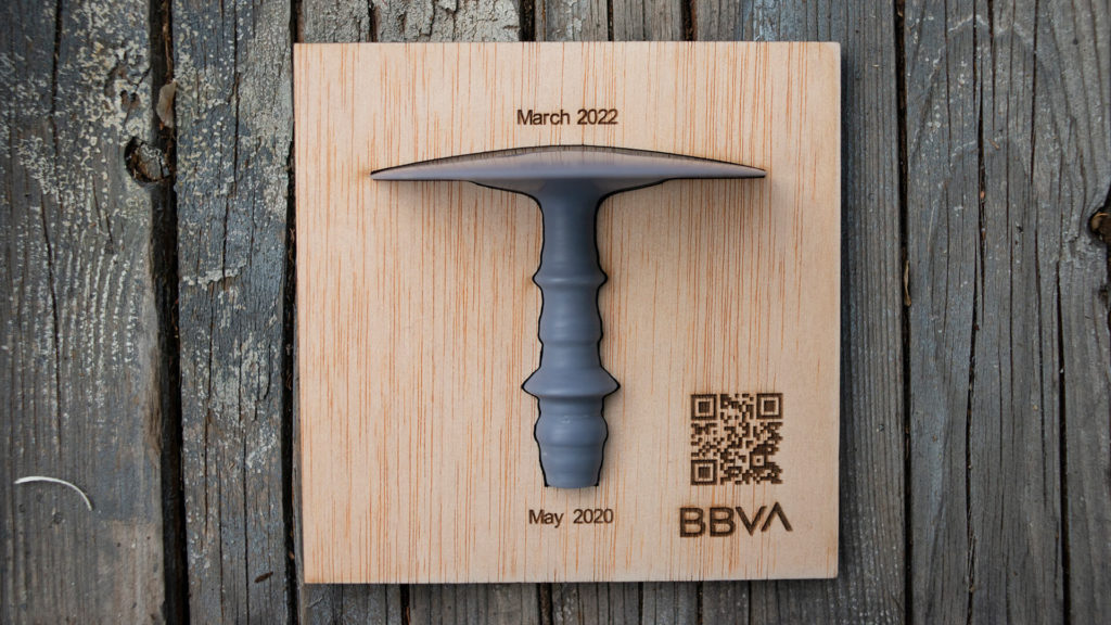
Previous examples of Tangible Data include a 3D model of Covid-19 cases. The model, based on a company dataset showing the early waves of the coronavirus and concluding with the explosion of Omicron, was attached to a wooden plinth emblazoned with a QR code that directed viewers to a hospital donation page.

This ethos is encapsulated by Tangible Data’s central framework: Feel, Remember, Act. The sculpture’s first impression is to ignite the senses, which then reinforces the message enclosed in the design and prompts voluntary action to address the issue raised.
Digital fatigue & fake news
The internet is awash with open data and information, although its accessibility varies around the world. However, this open nature of the internet, and of course social media, makes it prone to misinformation, fake news, and skepticism. Both Moneo and San Román believe that data physicalization offers a way to help combat this.
“There is a lot of data out there that is false. There are a lot of people who don’t believe in climate change, who don’t believe data. But if you go to such lengths to take the time and invest the money needed to display this design on the street, you make it more believable. I think it sticks more because it’s more direct,” San Román told REVOLVE.
Together with data visualization, we have a new cousin in the family, which is data physicalization, which is making data physical, and there’s data sonification, which is turning data into sound.
Moneo adds: “There are many public institutions that have invested a lot in data visualization and dashboards that actually do not work. I think there’s a general feeling that those visualizations don’t tell the story and we need other ways of representing the data.”
“Together with data visualization, we have a new cousin in the family, which is data physicalization, which is making data physical, and there’s data sonification, which is turning data into sound. There are other ways, but because of the evolution of technology and the decreasing costs, these techniques are becoming more available.”
For Moneo, growing public skepticism at a time of high investment in science and data, whether that be related to climate or to Covid-19, among others, is paradoxical. “The challenge is not only to make data available but to make it accessible for all. Data should reach people, and not vice versa.”